Answered step by step
Verified Expert Solution
Link Copied!

Question

1 Approved Answer

Question 4. Explain any conclusions you can draw from your data visualizations. A. Review the charts and discuss any conclusions you can make from those

Question 4. Explain any conclusions you can draw from your data visualizations. A. Review the charts and discuss any conclusions you can make from those data visualizations. B. Explain whether option A or option B will provide your company the most financial benefit. You should reference your data visualizations to justify your explanation and conclusions.
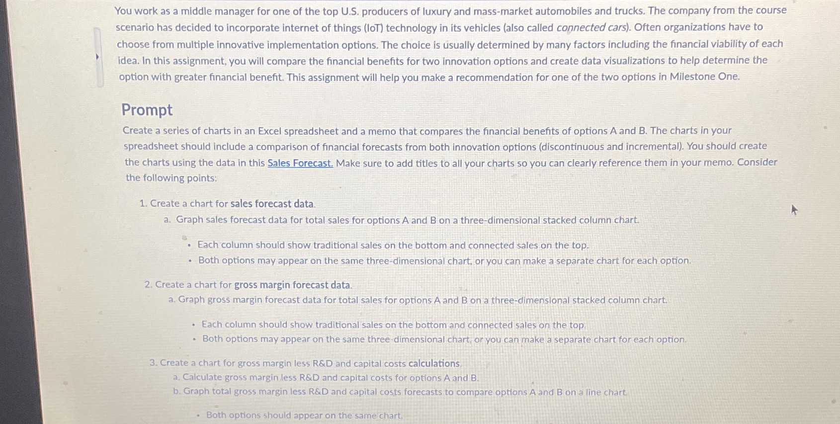
image text in transcribed
You work as a middle manager for one of the top U.S. producers of luxury and mass-market automobiles and trucks. The company from the course scenario has decided to incorporate internet of things (loT) technology in its vehicles (also called connected cars). Often organizations have to choose from multiple innovative implementation options. The choice is usually determined by many factors including the financial viability of each idea. In this assignment, you will compare the financial benefits for two innovation options and create data visualizations to help determine the option with greater financial benefit. This assignment will help you make a recommendation for one of the two options in Milestone One. Prompt Create a series of charts in an Excel spreadsheet and a memo that compares the financial benefits of options A and B. The charts in your spreadsheet should include a comparison of financial forecasts from both innovation options (discontinuous and incremental). You should create the charts using the data in this Sales Forecast, Make sure to add titles to all your charts so you can clearly reference them in your memo. Consider the following points: 1. Create a chart for sales forecast data. a. Graph sales forecast data for total sales for options A and B on a three-dimensional stacked column chart. . Each column should show traditional sales on the bottom and connected sales on the top. . Both options may appear on the same three-dimensional chart, or you can make a separate chart for each option. 2. Create a chart for gross margin forecast data. a. Graph gross margin forecast data for total sales for options A and B on a three-dimensional stacked column chart. . Each column should show traditional sales on the bottom and connected sales on the top . Both options may appear on the same three-dimensional chart, or you can make a separate chart for each option. 3. Create a chart for gross margin less R&D and capital costs calculations a. Calculate gross margin less R&D and capital costs for options A and B. b. Graph total gross margin less R&D and capital costs forecasts to compare options A and B on a line chart. . Both options should appear on the same chart

Step by Step Solution

There are 3 Steps involved in it

Step: 1

blur-text-image

Get Instant Access to Expert-Tailored Solutions

See step-by-step solutions with expert insights and AI powered tools for academic success

Step: 2

blur-text-image_2

Step: 3

blur-text-image_3

Ace Your Homework with AI

Get the answers you need in no time with our AI-driven, step-by-step assistance

Get Started

Recommended Textbook for

Tourism Concepts And Practices

Authors: John R Walker, Josielyn T Walker

1st Edition

0138142459, 9780138142452

More Books

Students also viewed these General Management questions