

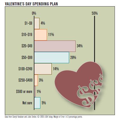
The graphic Valentines Day spending plan shows a relative frequency distribution. This graph qualifies as a tricky
Question:
The graphic “Valentine’s Day spending plan”
shows a relative frequency distribution. This graph qualifies as a “tricky graph.”
a. Is the graph a bar graph or a histogram? Explain.
b. How does this graph violate the guidelines for drawing histograms?
Step by Step Answer:

This question has not been answered yet.
You can Ask your question!
Related Book For 
Just The Essentials Of Elementary Statistics
ISBN: 9780495314875
10th Edition
Authors: Robert Johnson, Patricia Kuby
Question Posted:
